Purity Factories
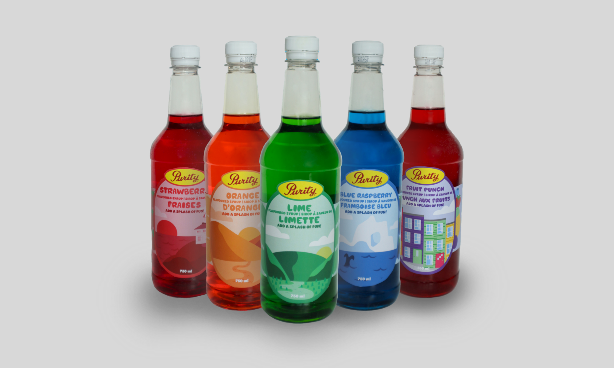
Purity Factories is a food and beverage company based in St. John’s, Newfoundland that is over a century old. With a rich history and product line to work with, this brand made for an excellent case study and redesign. I decided to develop some new concepts for their flavoured syrup line, with designs that not only honoured the company’s roots but connected these places to the colour scheme and flavour of the product itself.
ROLE: Graphic Designer
TEAM: Solo, MIT 2600
SKILLSETS: Adobe Illustrator, InDesign, Photoshop
PROJECT DURATION: 10 Weeks
Objective
Create engaging label designs for five Purity products that reflects the product characteristics and company origins.
Context
This project first emerged in my introductory graphic design project. We were first instructed to select a product label that we felt could be improved, and in my case, I decided to go with a set of five flavoured syrup bottles from Purity Factories. One of the reasons I decided to redesign Purity’s labels is because I wanted the personality of the flavour and its home province of Newfoundland to shine through. My mom’s side of the family lives there, so I have had many opportunities to visit, which was a big part of what inspired my process.
Exploratory Research & Initial Concepts
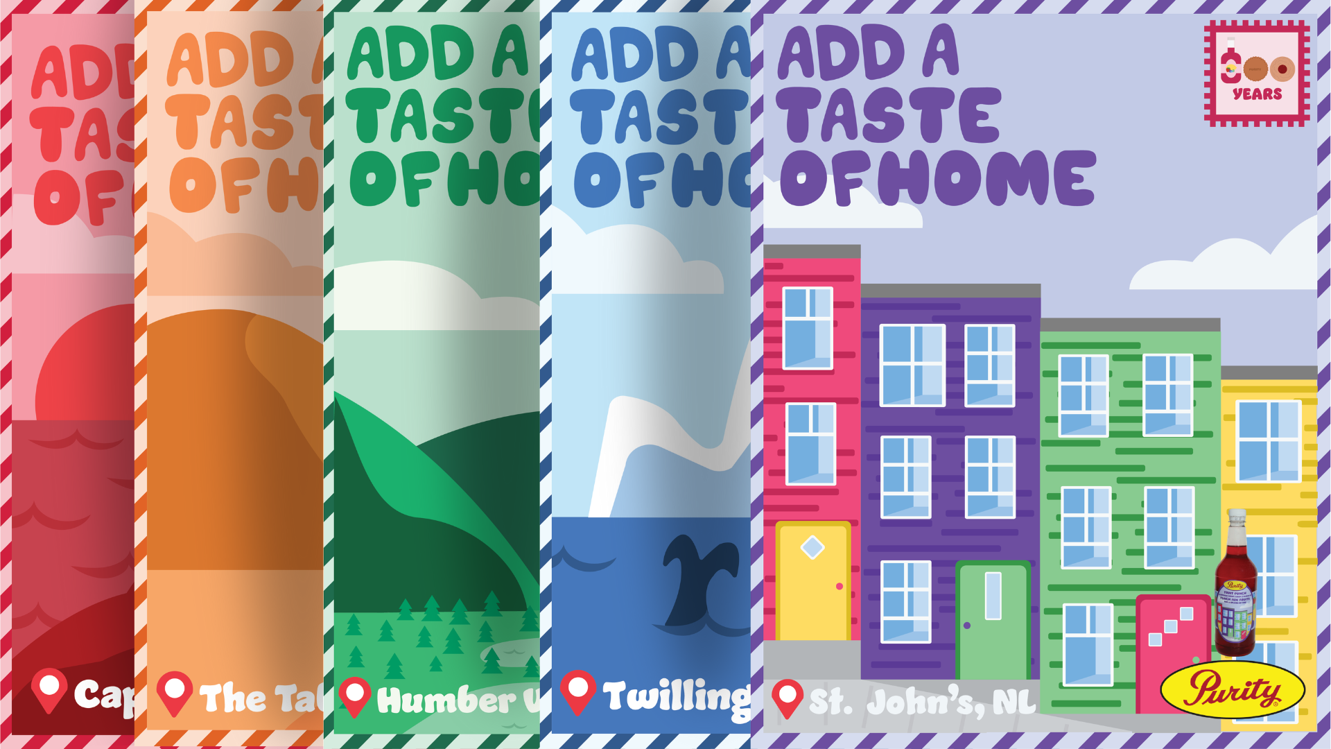
During my winter reading week, I decided to delve into researching and conceptualizing ideas for the product line as much as I could. I knew I wanted the products to be a physical representation of the province they came from, while connecting it with the actual product itself. I landed on five distinct concepts, each with a direct association to the flavour and province.
Strawberry - Cape Spear
Strawberry was paired with a deep red sunset at Cape Spear, North America’s easternmost point. Cape Spear remains one of the island’s biggest tourist draws, and it is easy to understand why, as it is adorned with beautiful coastal cliffs and a one-of-a-kind lighthouse.
Orange - The Tablelands
Orange was paired with the Tablelands, located on Newfoundland’s west coast and once the site of tectonic plate movements. Unlike the landscape around it, lush green forests that span for miles, the Tablelands got their distinct colour from the earth’s upper mantle, the product of tectonic plate shifts millions of years ago.
Lime — Humber Valley
Lime was paired with Humber Valley, also located on Newfoundland’s west coast. Home to skiing, hiking, and traces of the Appalachian mountains, this area is known for its lush forests and high elevations.
Blue Raspberry - Twillingate
Located on the northwest coast of Newfoundland, blue raspberry was paired with Twillingate, a charming town known for its magnificent views of icebergs.
Fruit Punch - St. John’s
Perhaps one of the most well-known parts of Newfoundland is St. John’s and its jellybean row homes, located in the downtown area of the city. Pairing fruit punch with this visual therefore felt appropriate.